Embracing Change

Embracing Change

In this blog, CEO Evan Bowen-Jones talk about the reasons behind our decision to refresh our famous ‘blue butterfly logo’.

In this blog I talk about the reasons behind our decision to refresh our famous ‘blue butterfly logo’, exploring the significance of our brand as we focus on delivering more ambitious conservation through our Wilder Kent 2030 strategy, and beyond.

Preserving heritage, embracing evolution

Founded on the principles of wildlife preservation and environmental stewardship, Kent Wildlife Trust has a rich heritage that spans several decades.

In fact, we’re celebrating 65 years of local action for wildlife this year. Our logo, the Adonis Blue Butterfly, has become a symbol that encapsulates this. It has become a  short-hand for trusted nature conservation in Kent and further afield.

However, as times change, organisations must evolve to stay relevant and effective. And, as our sister Trusts have modernised the badger logo to signal that they are moving with the times, so we have decided to update our own logo to reflect this update and visually signal that we stand strong with other Wildlife Trusts across the UK whilst retaining our local identity, which we believe is where the Wildlife Trust Federation ultimately derives its greatest collective strength.

The decision to refresh our logo is, therefore, not a superficial change but a strategic move to signify our renewed ambition whilst remaining true to our roots.

At a moment when environmental challenges are more pressing than ever, the Trust recognises the need to both reinvigorate our commitment to our original mission whilst signalling our willingness to move with the times and deliver more for the natural world and inspire a new generation of wildlife advocates.

Adapting to the digital age

The digital age has ushered in a new era of communication and interaction. Social media, websites, and mobile apps have become powerful tools for spreading awareness and mobilising support. Kent Wildlife Trust, like many other organisations, acknowledges the importance of a logo that translates well across various digital platforms.

The new logo has been designed with adaptability in mind. Its sleeker, more modern design ensures clarity and legibility even on small screens, enabling the Trust to reach a wider audience online. This was the logic behind the refresh of the badger logo for The Wildlife Trusts across the UK, which we are now echoing here in Kent.

Our use of an icon which can be separated and stand alone as a symbol allows us to stay easily recognisable and memorable. It also works well and can be used without text in branded merchandise and social graphics. This will help us make the most of digital platforms to engage with supporters, share educational content, and advocate for conservation efforts.

Symbolising progress and unity

A logo is more than just a visual representation; it is a symbol of an organisation's values and aspirations. Kent Wildlife Trust's refreshed logo reflects our sense of solidarity with Wildlife Trust’s across the UK through design elements that have been carefully chosen to reflect all the Trusts’ commitment to protecting wildlife, preserving natural habitats, and fostering a sense of community.

The incorporation of vibrant, nature-inspired colours signifies vitality, growth, and impact. The harmonious blend of these colours represents the interconnectedness of all living beings and ecosystems, whilst emphasising the importance of unity in the face of environmental challenges. The carefully chosen typeface complements the imagery, evoking a sense of professionalism and reliability.

Fostering a stronger connection with the community

A logo is a powerful tool for building brand recognition and fostering a sense of belonging within a community. Kent Wildlife Trust's new logo serves as a visual bridge, connecting the organisation with its existing supporters while also inviting new members into the fold. By modernising its visual identity, the Trust aims to create a lasting impression on individuals, encouraging them to actively participate in delivering conservation action.

The refreshed logo has already started to strengthen the sense of community within Kent Wildlife Trust. This shared visual identity fosters a sense of pride among members, volunteers, and staff, reinforcing their commitment to the Trust's mission.

Conclusion: embracing the future

In today's fast-paced world, organisations often find themselves at a crossroads where they must balance preserving tradition with embracing change. Kent Wildlife Trust is a beacon of conservation hope in the busy southeast of England. The Trust has recently been undergoing a significant transformation in overtly stepping up its level of ambition to meet the challenges posed by the climate and nature crisis.

Refreshing our logo is part of this statement of intent. We are signalling the urgent need to take action We are embracing the dynamic, challenging future while honouring our organisational heritage. We are reflecting our commitment to operating effectively in the digital age. And, we are expressing our commitment to Kent’s iconic wildlife within the UK-wide conservation community that has to deliver at a much greater scale than ever before.

As we continue our journey to a Wilder Kent by 2030, our refreshed logo stands as a testament to the Trust's enduring mission and a future where wildlife thrives thanks to local communities who value it for the positive difference it makes to their lives. #WilderKent.

FAQs

Is this a rebrand?

No, this is a refresh of our current branding. We are retaining much of the existing elements that are part of our familiar visuals but are updating the logo and refining some of the guidance to meet our growing digital needs and to bring a sense of consistency to the branding of Kent Wildlife Trust and the wider Wildlife Trust movement. The need for modernisation has been highlighted through market research over the last few years, and with the launch of a new collective strategy it felt like the right time to address this.

How much did it cost?

All costs associated with this update have been limited to market research completed by the wider Wildlife Trust movement and our own. This included a round of qualitative testing with two focus groups, some quantitative testing using data analysts, YouGov and email surveys to our members and supporters. Aside from the market research, internal costs have been minimised, with staff at the Trust working within their normal working hours. Design work was all completed in-house, and we will be launching online only initially to limit costs, whilst ensuring that more costly items like signage are replaced gradually and in line with their usual lifespan.

Why did you decide to keep the Adonis blue butterfly?

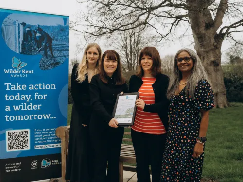
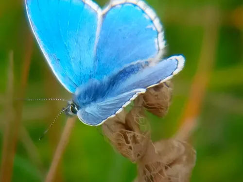
Over the past few years, consultation with membership and staff, alongside the market research activity undertaken, all supported the decision to retain the Adonis Blue Butterfly as a key element of our visual identity.  We also continue to support the conservation of this species by restoring and protecting the chalk downs that they rely on. We still feel the Adonis Blue Butterfly is a symbol of this quintessential Kentish landscape and we want to continue to show our support to this rare species which we’re so proud to have a part in conserving for over 65 years of existence as a Trust.

In addition, there is demonstrable brand recognition value in retaining the Adonis Blue visually and evolving the logo, rather than re-designing and relaunching our brand identity. It means that we don’t need to replace everything at once to retain our brand identity and so limit costs too.

Will the new logo impact the charity's programs or services?

We were able to undertake this logo refresh without needing to reallocate resources or time. Much of the work was done by our in-house design team, taking the elements already developed by The Wildlife Trusts and the launch was delivered by our marketing team in their normal working hours.

As we’re launching this refresh in a phased approach, you may still see our old logo on signs or merchandise, but all new materials will be printed with our new logo and over time, we will see the old logo phased out.

Where can I access the new logo and brand guidelines?

If you have an upcoming project or activity that you’d like to include our logo on or would like to replace our old logo with the new one please get in touch to get this replaced by emailing comms@kentwildlife.org.uk.

Will there be events or campaigns related to the new logo launch?

Not specifically linked to the branding no, but our revised logo will become part of our ongoing work as we continue to engage with our communities with a range of events and activities to inspire people to take action for nature. Our logo may have changed but the threats to Kent’s wildlife and wild spaces remain so we hope our refreshed branding will help new audiences to connect with us and help to create a #WilderKent. If you’d like to hear first about our plans and upcoming activities please join as a member.